Realizing the Potential of Big Data in Local Government

As much as we hate to admit it, we humans are a fairly predictable bunch. Our habits, routines, and preferences generally remain the same until some external circumstance changes or life event such as moving, getting married, changing jobs, etc. occurs.  (If you doubt me, I would highly recommend Charles Dugg’s book “The Power of Habit” to learn why).

This is why in job interviews, interviewers usually ask a few “Tell me about a time when…” questions. They are trying to learn about past behaviors of the interviewee in order to gauge potential for future success. 

Read More

Five Rules for Growing Data at your Organization

gardening.jpg

Despite the 5 inches of snow that just fell on the Chicago area, spring is technically here, which means that warmer weather is hopefully just around the corner.  And with that comes my annual gardening dilemma.   To grow or not to grow - that is the annual question.  

It all started one summer when I decided to grow a garden.  I only had one problem - no space to actually grow a garden.  Too much of our backyard was covered in shade and there was too little backyard to start with.  However, any of you that know me know that a tiny issue like that isn't going to be enough to deter me.

So for my first attempt (yes, this a multi-year gardening saga), I decided to be reasonable and start with some large pots that could sit on a concrete patch that gets plenty of sun.  I planted a few smaller items like strawberries, herbs, and tomatoes.  I was excited when they started to grow.  Apparently so was the local wildlife who ate the majority of the plants.  Not to be outdone, I decided to try to save what was left and move the plants on top of a table.  That seemed to be working really well andI even had a few strawberries that started to grow and was looking forward to my minuscule harvest.  Unfortunately so was a squirrel (my best guess) and I ended up with nothing but some pots full of soil.

Fast forward to summer #2.  This year, I was getting serious.  I built some cages made out of PVC pipe and bird netting that would keep rabbits, squirrels, birds, etc. out.  I upgraded to self-watering planter boxes that were on wheels so that I could better take advantage of a some sunny days and move them out of the way when I actually wanted to use the patio.  And since I was going so full-force, I decided to expand my plant selection and added lettuce, melons, and other fruits and vegetables.  I definitely had better success than the year before.  All of my plants started to grow and were safe from the animals.  I lost some in expected ways (bugs) and some in unexpected ways (my dog's enthusiasm to be near me when we're outside lead to some heartbreaking moments when many of my melons were crushed under the weight of his paws).  I was able to pick a few items here or there, but admittedly was not nearly as attentive as I should have been since I was also in the process of training for my first marathon along with a full-time job.  And the worst part is that I was out of town when some of my best chances for a decent harvest happened.  So, I beat the wildlife this year, but in the end, really didn't come out much better than the year before.

On to summer #3...  I still had all of my pots, boxes, cages, and contraptions from the previous of two years of gardening warfare.  So what did I do?  I took one planter box and one cage and planted one plant - cilantro.  It was easy to tend to and grew well.  And it wasn't susceptible to squirrels or bugs or my dog's enormous paws.  I tended to it much more frequently, which wasn't really too much work since it was only one plant.  So what was the result?  Fresh cilantro all summer and fall long.  My tacos have never tasted so good.

So you may be asking what the heck this has to do with data and this website?  Well, a lot as it turns out. Here are my Top 5 rules for growing the use of data at your organization as it relates to gardening.

  1.  Expect challenges.  Each time I overcame one challenge in gardening, it seemed like another one popped up.  Working with data is a little like that, but just like gardening, the more that I've worked with it, the more that I've learned to refine my techniques. Data, just like plants, might seem to be easier to deal with than people, but both have a life of their own.  Just because numbers can't talk back doesn't mean that they will tell you what you want to hear.  
  2. The animals can drive you crazy.  So maybe it's not smart to call your co-workers "animals," but it's accurate with this analogy.  Just like you might think that gardening is about plants and data is all about numbers, neither live in a vacuum.   People will be scared, angry, confused, doubtful, defensive, and even apathetic in regards to any form of measurement - all of which puts the use of data in danger.  It's important to be aware of this and account for it if you want to have a successful data program.
  3. Cool tools help, but only so much.  Those planter boxes helped me grow more varieties of plants and also led to a better harvest, but ultimately, if you're not there to tend to the plants (or the data) and make time to use it when it becomes available to you, it really does you no good.  There are some great tools to help make data collection, viewing, and analysis easier, but if you're not going to put yourself in a place to use it, you shouldn't waste the time and effort.   
  4. More varieties = more results (and more work).  If you want to get a fuller view of what is going on at your organization, it's important to have a well-rounded and well-thought out approach to data collection.  But with every piece of data that you collect (just like with every plant you decide to grow), you have work to do in monitoring, gathering, preparing, viewing, analyzing, and using.  It's easy to get excited at the beginning of the process and bite off a bit more than you can chew (like I did in summer #2).  If you want a full garden, it's possible, but just realize that you can't plant it and let it grow on its own and hope it turns into something usable.  You'll need to do a lot of work along the way, but the rewards are definitely worth it.
  5. Sometimes you only need to do one thing really well.  Normally, I'm all about getting that overall view of an organization through a well-rounded set of data.  However, sometimes it's better just to measure one thing and go all out.  Like in summer #3, when I planted only cilantro, but had some great cilantro to use all year long, tracking only one thing could be best.  One real-life example of this was the time that I took over a set of summer camps at a new job.  There were a lot of improvements that I wanted to make, but instead of focusing on everything with staff, I picked one thing and drove it home through training, with constant emphasis throughout the summer, and by sharing the results from parent evaluations with staff.  The end result?  Not only did we make the improvements we were going for, but we also saw our registration numbers increase, staff satisfaction increase, and return rate increase.   Sometimes, when you really focus on fixing or improving one thing (or growing one plant), you end up being more successful than you would have if you had tried to do too many.

Whether you're growing data or vegetable, it's sure to be a bit of a messy process, but hope you agree that it's worth it in the end.  And, if anything, at least you've got a new person to laugh with about it all when it doesn't go exactly your way. :-)

This One's for the "People Persons"

Over the past two weeks, I've had the opportunity to present a session entitled "Counting What Counts: Using Data to Drive Real Change" at two park & recreation conferences.  I was thrilled with the participation at both, but noticed that after each session, I had several people make a comment to me along the lines of:

"I'm more of a people person, and I actually really enjoyed your session."

While I'm excited that A) people enjoyed the sessions, and B) people who wouldn't typically gravitate towards numbers and data decided to spend over an hour learning about it with me, I think that it shows that there's still a real misconception that data is only for "numbers people."  Now I know that I'm (proudly) a little geekier than the average population when it comes to this stuff, but I promise that data doesn't have to be intimidating or boring.  And when presented thoughtfully, data doesn't even have to include numbers.

Have I completely confused you?  Stay with me while I prove it with the following equation.  

So people result in some sort of interaction, which results in data.  Easy, right?  And I didn't even need to use numbers!

Well, if the above equation is true, Algebra 101 tells us that the following equation is also true (and you thought you'd never use algebra again...).

What's this mean?  Well, if we want to, we can use data to affect interactions, which will in turn affect people.  Sound too simple?  Well....math, data, and all that stuff that sometimes seems confusing really doesn't have to be hard.  But if you need some proof, here's a recent real-life example.

One of the performance indicators that we track at my agency is the percent of households in our community that complete a transaction with us each year.  This includes any household that registers for a program, buys a pass, rents a facility, donates to our scholarship fund, etc.  We had no idea what to expect from this metric, so in 2013, we let our customers take the lead.  In this case, people interacted with our park district, which resulted in data that told us that 26% of households in our community completed a transaction with us in 2013.

Or in other words, PEOPLE = INTERACTIONS = DATA.

Since we really haven't found any other park & recreation agencies tracking these same metrics, we really had no idea whether or not this was a typical result.  But regardless, we decided to work on improving this number in 2014.  Using our newfound data, we focused the entire year on our interactions with our customers, which went something like this:

As an agency, we worked together to attract new customers to our park district.  These efforts led to the highest number of program registrations since we started tracking this number in 2007 and also the highest number of pass sales in recent years.  We had set the lofty goal to increase that household participation though and so when mid-December came around and we still hadn't reached it, we came up with an plan.

We reviewed all of our customers that had participated with us in 2013, but hadn't returned in 2014 for some reason.  We learned that this amounted to 1,400 households, which seemed like a large amount, but dug a little deeper and found out that this meant that our household retention rate was 75%, which didn't seem so bad afterall. (Side note, this is why it's so important to dig deeper when you have questions about your data, instead of just going back to making assumptions about the initial results.)  We then contacted those 1,400 households to let them know that we missed them and offered them a coupon to come back by the end of the year.  We should have given ourselves more time to get this effort out to make it more convenient for customers to take advantage of it, but it was a our first time and we decided that trying something is better than nothing.

The result of that coupon? Ten households took advantage of the offer. Sounds like a terrible response, doesn't it?  Well, even though we would have loved to see a higher number, because of other available data, we know that our average customers spend $630/year with us.  This means that for a $250 goodwill investment ($25 coupon X 10), we were able to serve 10 more households.  And if they enjoy their program/pass and continue as a customer in 2015 with us, we could earn an estimated $6,300 return, which in turn allows us to provide even more services to our community.  One of those 10 people even wrote a letter to our Board president expressing that she was excited about our park district's new fitness options and that she appreciated our offer and was going to sign up for an on-going membership with the park district.  Suddenly not so shabby of a result, huh?

So how did it all end?  Well, with less than 48 hours left in the year, we met our target and increased our overall household participation to 30% or 816 additional households.

Or in other words, DATA = INTERACTIONS = PEOPLE.  See how that works?

That means that because of our focus on data, we were able to positively affect people in the following ways:

  • our staff rallied around a common goal,
  • we learned new data about our agency that will help us better understand how well we are serving our community,
  • our staff initiated a new marketing effort that they want to repeat and improve upon for next year, and
  • we increased the number of people served and were able to offer more recreation opportunities to our community than even before.

The simple fact is that when you really think about it, those "numbers" are people, so when you care about the right numbers, you're really caring about people.  And this means that anything you do to positively affect those numbers is also positively affecting the community that you serve.  

In fact, the more I think about it, maybe when it comes down to it, those "people persons" might have the potential to be the biggest "numbers persons" of us all?
Data is not a Four Letter Word

Today was an amazing day.  Why?  Because I got a high five.  What makes a high five so amazing?  Because it came from my district's part-time ice hockey coordinator who walked into my office to congratulate me on the fact that we met one of our performance measures that we had been shooting for this year.  As part of our district's organizational performance measures, we had been making a big push to increase the number of households in our community that had completed a transaction with us in 2014.  We had only about 48 hours to spare before the end of the year, but we did it.  That 4% increase over the prior year meant that we served over 800 additional households than we had the year before.  And that high five meant that even our part-time recreation staff were starting to understand the benefits and importance of our performance measurement program.

To say that my fellow co-workers do not always share my love of data would be an understatement.  I'm not sure why this still surprises me because I have been teased for my math/data tendancies my entire career.....like the time that I plotted out our daily pool concession sales versus the weather so that I could figure out at what temperature we needed to bring an extra staff member in.  (Okay, that is pretty geeky.)

I think that the big difference at this point in my career is that a good portion of my job is now digging up, analyzing, and displaying data, not for my benefit, but actually for use by people who may not initially care for it so much.  And because of the time and resources put into creating these initiatives and the value that they acutally hold, it is expected that they use them.  It can be easy to look at your fellow professionals and just expect them to do the work because it's their job.  But actually, that's not good enough for me.  I want them to be as excited about it as I am.  Or at least half as excited, because let's face it, that's still pretty darn excited.

So instead of getting frustrated, I have to constantly refocus my energy from getting staff to use software and excel sheets and instead imagine that I'm on an epic quest to rebrand math and numbers.  So how the heck do I do that?  

One of my big data initiatives is managing our district's performance measurement program, which includes the use of dashboards where staff can view live results of our key metrics.  I wanted to really reinforce that these charts and graphs are not scary.  They are just data...just like the data that we use every single day without even realizing it. So to hit this home, I brought some charts and graphs with me to the kick-off for staff.

An actual "pie chart!"

Best part about the bar graph?  I learned more data....our employees do not like lemon bars.

The staff really seemed to get a kick out of the snacks and I think that it helped set a great tone for the project.  What do you think of them?  What have you done to make data cool (or at least tolerable) at your organization?

Running Towards Data

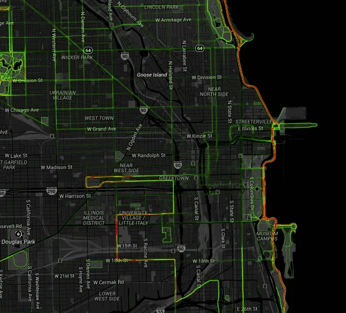
Being a data geek and a runner, it's probably not that surprising that I wear a watch for each run.  By downloading the data, I have information about my speed, my distance, my heart rate, and even GPS information about where I ran.  I noticed a really cool feature on my GarminConnect account (the website I use to log all of my runs) using that GPS data.  Not only could I see a map showing where I ran, but one that compiled all of the data into a heat map showing where other users had run as well.  

For users, this feature is really cool if you think about it creatively.  If you're looking for a new place to run in your area, just zoom in to a nearby area to see where other runners are going.  Also cool, you can zoom out further to get a quick glimpse into the best running cities in the USA.  And even better, when you're in a new city, you can use websites like these to figure out where the most popular running paths are.  This came in incredibly handy when I visited Europe last fall.  It turns out that not many people run in Sarajevo, but luckily my hotel was right next to the most popular street in the city.

This got me thinking though....if I can look at this data to find out where people in my area are using their walking, running, and biking paths, couldn't local governments also use this data to help determine the popularity of those paths that they maintain?  Data like this could help set priorities for capital improvements and additional amenities like water fountains, signage, and bike racks.  It could also help local govnements determine where they need to focus on installing new paths, especially ones that may connect two well-used paths.

Strava runners in Chicago

Turns out my hunch wasn't that far off.  Last fall, the state of Oregon actually paid Strava, a well-known app used by cyclists, $20,000 for a one-year license of a dataset that includes the activities of about 17,700 riders logging 5 million miles on their bikes.  Interested in seeing an overview of data in your area without the pricetag?  Strava has now posted information online for advocacy groups and the public to view at http://labs.strava.com/heatmap/.  On this site, you can view biking, running, or both.  Strava is generally more popular with cyclists than runners and walkers, so you may want to also look at Garmin data, and other popular websites like MapMyRun.

Of course, it's important to recognize that the data that these maps show is not representative of the general public.  In fact, many of these data points come from more serious runners and cyclists than the majority of your users.  However, knowing how hard it can be to get any sort of data on these types of user groups in your parks, it may be an important first step.  What do you think about this opportunity for local governments?  Has your agency ever used data like this before?  And if you're a user of apps like Strava and Garmin, what do you think about your data being sold?